Search
STC Craft | Melanie Falick Books
Thank You For Visiting!

On this blog we share stories and ideas about the work we do at STC Craft and the craft world overall.


Join Now!


STC Craft Video
Wee Wonderfuls

Kaffe Fassett's Simple Shapes Spectacular Quilts

Kata Golda's Hand-Stitched Felt

Connect with STC Craft
STC Craft on Facebook

www.flickr.com
This is a Flickr badge showing public photos and videos from STC Craft / Melanie Falick Books. Make your own badge here.
Look Inside Our Books

Crafting a Meaningful Home

Modern Top-Down Knitting

Wee Wonderfuls

Kaffe Fassett's Simple Shapes Spectacular Quilts

Knits Men Want

Alabama Studio Style

Reversible Knitting

One More Skein

Knitted Socks East and West


« My New Year's Resolution | Main | Our First Peek at 2010 -- Alabama Studio Style by Natalie Chanin »
Monday
Dec212009

Reversible Knitting by Lynne Barr--How We Chose the Cover

All of us at STC Craft were excited and intrigued by the response to our Reversible Knitting cover post. Over 550 of you shared your opinions about the cover we chose and the three runner-ups. So, for today's post, as part of the Reversible Knitting blog tour,  I'm going to explain to you how we made our decision.

All of the covers and the interior of the book were designed by Sarah Von Dreele, with photographs by Thayer Allyson Gowdy. For several weeks Sarah and I collaborated on the cover design in preparation for the meeting at which I would present the choices to the cover committee (a group composed of our CEO as well as individuals who hold key positions in sales, marketing, publicity, and editorial). The cover committee makes the final cover choice.

Top left: Everyone loved this cover because of the great texture of Wenlan Chia's Winding Path sweater and because of the way it shows the two sides of the knitted fabric, plus the swatches of course. The cover committee was concerned that we might not be showing enough sweater and didn't like the model looking down (away from the customer). The Traveling Path sweater can be worn as shown on this cover as well as inside out and upside down (see bottom left cover and the gallery).

Top right: Graphically, this cover (like the others in this format) works beautifully, however no one felt that Lynne Barr's Two-Tone Vest was as eye-catching on the cover as the other options. One of the cool aspects of this vest is that it can be worn with either side of the fabric right side out and with either side in front or back (check out the gallery to see what I mean).

Bottom left: This cover, showing Wenlan Chia's sweater worn with the reverse side of the fabric outward (compared to the way it is being worn in the top left cover), was never a serious contender because it didn't show the swatches (such an integral part of the book) and because the color and graphic design seemed dull compared to the other options. That is why when I read everyone's responses, I was so surprised to find out how many people thought this was the best cover of all. I'll definitely keep this reaction in mind as we work on covers for future books.

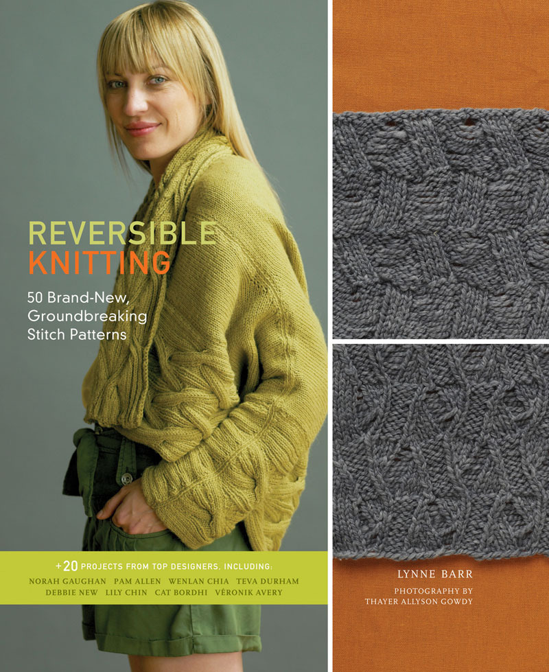
Bottom right: This was the cover committee's top choice because it is colorful, shows a beautiful garment with a reversible cable (Reverse Me designed by Norah Gaughan), plus the swatches, and because the model looks friendly and approachable. Overall, this is the cover that everyone believed said "Pick up this book and take a look inside" most boldly and that, of course, is a cover's main purpose.


Thanks to everyone who commented . The winner of a copy of Reversible Knitting will be notified after the contest ends at 11:59pm on December 21, 2010. Meanwhile, if you have a few minutes, check out this fascinating Q&A with Lynne Barr here.

Reader Comments (6)

Funny about why people liked the chosen cover -- because I was a little put off by the slouchy and smirky way the model looks. I bought the book because I think Lynne is a brilliant out-of-the box thinker. It didn't matter at all to me what was on the cover but I think it actually detracts from the book. It's a great book!

December 21, 2009 | Unregistered CommenterMerna

I didn't get this book for Christmas, so I bought it for myself. I think its great - the stitch patterns are interesting and I do like the patterns, especially the cover pattern.

January 1, 2010 | Unregistered CommenterConnie

I bought the book for the Wenlan Chia sweater, bottom left. The cover knit looks so shapeless and doesn't look flattering on the model.

January 6, 2010 | Unregistered CommenterMichele

I find it interesting that the production team was puzzled by the popular support for the bottom left cover. In my opinion (the only one I can account for) the bottom left was a winner because the pattern is so unusual and flattering and cool—I wanted to knit it immediately. The green sweater does look a lot like other slouchy, casual cardigans out there, and doesn't stand out as much. Plus, I agree with the earlier commenter that the model's expression is not as approachable as the prod. team seems to have thought! Good luck with the book, it is a great idea, and I'd like to see a sequel.

January 10, 2010 | Unregistered CommenterCristina

I would have purchased the book immediately if the bottom left picture had been on the cover. I love the pattern and the possibilities I see in it are limitless. I didn't care for the cover photo design and would not consider making it for anyone I knit for. After reading this post, I really looked at the cover photo to see if that was the only reason I was dismissing the purchase of the book but found that the model looks as if she is wearing shorts and her hair color and color of knitted garment is so pale against the gray background that it's not what I want to see in a book being released in the Fall and Winter months. Even though the bottom left sweater is close to the background color, the pattern stitch screams out and the contrast is unique. Sorry I missed any chance to vote on the cover because the one chosen would have been the second least favorite right after the top left which doesn't even show a full garment preview. Given the opportunity, I would have quartered the cover images with a picture of the bottom left in one quarter, the top right in another quarter and peeks of the new reversible stitch patterns in the other two. Both of those patterns are garments that could be worn by many different age groups and shapes with many different type yarns. This selection would have given those of us who buy our pattern books online a good representation of what the book represents. The cover pattern, I am sure, will be loved by many but bet not as many as will like the other two garments shown above. Also, I don't even look at the models in fiber based pattern books and magazines, much less whether they are looking down or at me. I am looking at the garment. I am considering a purchase based on whether I would use any of the patterns for myself or family and no other reason so the more creative design, while still being something non-models would look good in, the better! I am excited to get the book now and will probably make the "upside down option" pattern for both daughters. That is just too much fun to not try!

January 11, 2010 | Unregistered CommenterJane in NC

I'm surprised that the popularity of the bottom left baffled the committee. Since most knitters find swatching the necessary evil of knitting, showing two swatches on front seems rather boring. I loved the bottom left because of the simple graphic design, the very cool and original sweater, and the engaging look of the model. Looks like a great book though! Thanks for sharing the process with us.

February 2, 2010 | Unregistered CommenterJill DiMassimo

PostPost a New Comment

Enter your information below to add a new comment.
Author Email (optional):
Author URL (optional):
Post:
 
Some HTML allowed: <a href="" title=""> <abbr title=""> <acronym title=""> <b> <blockquote cite=""> <code> <em> <i> <strike> <strong>