Search
STC Craft | Melanie Falick Books
Thank You For Visiting!

On this blog we share stories and ideas about the work we do at STC Craft and the craft world overall.

Connect with STC Craft


www.flickr.com

Follow Me on Pinterest

This area does not yet contain any content.
STC Craft Video

The Repurposed Library
by Lisa Occhipinti


Oliver + S Little Things to Sew
by Liesl Gibson

Look Inside Our Books!
Galleries
« Announcing Our New Fall Books | Main | Behind the Scenes on The Shape of Knitting Photo Shoot (plus Interview with photographer Thayer Gowdy) »
Thursday
May172012

Behind the Scenes: Choosing a Cover for Modern Quilts, Traditional Inspiration

The title of Denyse Schmidt’s Modern Quilts, Traditional Inspiration perfectly expresses the book’s aim: to explore the traditional roots of a gorgeous collection of modern quilts. When we were deciding on a cover for the book, we knew we wanted this melding of modern and traditional to come across loud and clear.

Throughout the book, John Gruen’s beautiful photographs show Denyse’s quilts in contemporary interior settings, disputing the notion that quilts make an old-fashioned statement. So our graphic designer, Brooke Hellewell Reynolds, started our cover experiments with a simple and lovely photo of the Shoeman’s Puzzle quilt in a clean setting.

It’s a bit quiet, which is part of its appeal, but it doesn’t have the star power necessary for a cover. Luckily, it’s pretty and soothing vibe worked perfectly for the back cover of the book!

Denyse herself steered us in the right direction. She sketched up a vision she had: a super close-up photo of a quilt, stripped bare of the interior settings. 

Here are Sawtooth Stripe and Irish Chain. We were getting warmer!


Ocean Waves is a quilt that many pick as their favorite from the book. Unfortunately, there's no room for type!

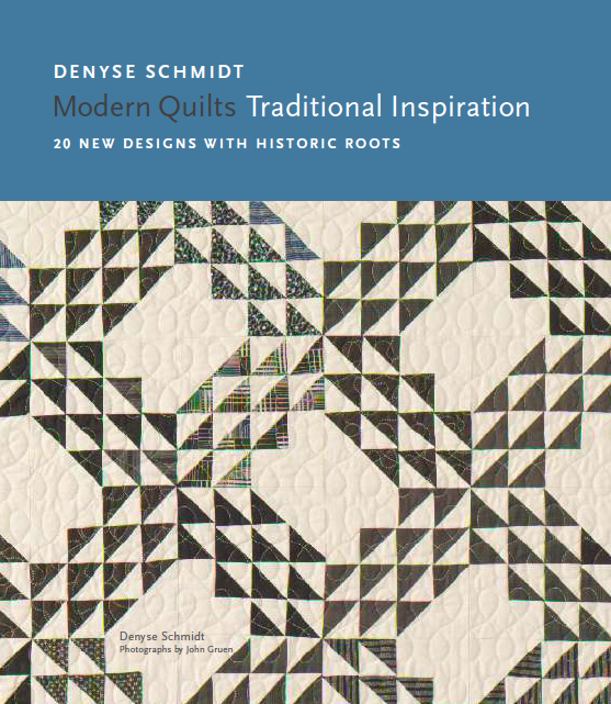
The winner: Courthouse Steps. The diagonal design gave us both intense color and clean white space. Paired with the modern type, it looks graphic and fresh. But the blown-up stitches remind us of quilting’s traditional roots.

What do you think? Is the final cover your favorite?

Reader Comments (5)

I would have liked the first photo ~ has a nice homey feel to it ~ plus I love the quilt featured. I do like the one chosen tho.

May 17, 2012 | Unregistered Commenterelsa

The final cover is very good indeed, but the text feels crammed in to me. I love the splash of color on the steps, and the slash of color in the chains, but actually prefer Sawtooth Stripe. The sawtooth pattern points to the title. Nothing feels forced. I agree that the first choice is perfect for the back cover. What fun you have to be able to work on this!

June 1, 2012 | Unregistered CommenterKangath

1 cover is my favourite, the others are a bit blah ! not really a modern look

June 23, 2012 | Unregistered CommenterHouse of Pinheiro

yep, you got it right! i love it, though irish chain is great too- just not the color pop of this one!

June 28, 2012 | Unregistered Commenteramorette

I love the first cover best of all. I agree that the one you chose catches your eye because of that pop of color, but the first cover drew me in and made me want to linger, looking at everything in the photo. I think if I saw them side by side in the bookstore, I'd want to pick up the first cover right away.

July 10, 2012 | Unregistered CommenterDianne@sheepdreams

PostPost a New Comment

Enter your information below to add a new comment.
Author Email (optional):
Author URL (optional):
Post:
 
Some HTML allowed: <a href="" title=""> <abbr title=""> <acronym title=""> <b> <blockquote cite=""> <code> <em> <i> <strike> <strong>