Behind the Scenes: The Knitted Slipper Book

We recently had an STC Craft first: a photoshoot in Asia! We feel so global chic. Mika Nakanishi photographed The Knitted Slipper Book by Katie Startzman, coming out in fall 2013,  in Tokyo. Our fabulous graphic desiger, Miao Wang, sent us some Instagram updates directly from the studio.

Even though we’re having a heat wave here, don’t these cozy slippers still look tempting? (And what about that baby?!)

I love how the weathered interiors of the photo studio create a contrast to the colorful footwear.

These bright blue ballet slippers are adorable. (And how about those striped tights?)

And what a gorgeous group of models.

A brilliant splash of color brightens up concrete walls.

Mika checks some settings while a little model patiently waits.

I can already hear the requests for these animal slippers in adult sizes.

How do we say "We love it!" in Japanese?

Behind the Scenes: Choosing a Cover for Modern Quilts, Traditional Inspiration

The title of Denyse Schmidt’s Modern Quilts, Traditional Inspiration perfectly expresses the book’s aim: to explore the traditional roots of a gorgeous collection of modern quilts. When we were deciding on a cover for the book, we knew we wanted this melding of modern and traditional to come across loud and clear.

Throughout the book, John Gruen’s beautiful photographs show Denyse’s quilts in contemporary interior settings, disputing the notion that quilts make an old-fashioned statement. So our graphic designer, Brooke Hellewell Reynolds, started our cover experiments with a simple and lovely photo of the Shoeman’s Puzzle quilt in a clean setting.

It’s a bit quiet, which is part of its appeal, but it doesn’t have the star power necessary for a cover. Luckily, it’s pretty and soothing vibe worked perfectly for the back cover of the book!

Denyse herself steered us in the right direction. She sketched up a vision she had: a super close-up photo of a quilt, stripped bare of the interior settings. 

Here are Sawtooth Stripe and Irish Chain. We were getting warmer!


Ocean Waves is a quilt that many pick as their favorite from the book. Unfortunately, there's no room for type!

The winner: Courthouse Steps. The diagonal design gave us both intense color and clean white space. Paired with the modern type, it looks graphic and fresh. But the blown-up stitches remind us of quilting’s traditional roots.

What do you think? Is the final cover your favorite?

Behind the Scenes on The Shape of Knitting Photo Shoot (plus Interview with photographer Thayer Gowdy)

Thayer (right) and stylist Karen Schaupeter on the photo set for The Shape of Knitting

Thayer Gowdy is a superstar at STC Craft. She’s an incredibly talented photographer who has shot a whopping 11 of our books, including Knitting Nature, The Repurposed Library, Printing By Hand, Reversible Knitting, and many more. I recently got to interview Thayer after she sent us some fabulous behind-the-scenes shots from Lynne Barr’s upcoming book, The Shape of Knitting (to be published on our Spring 2013 list). Read on for Thayer’s take on working on craft books, spontaneity on set, and incorporating confetti (lots of it!) into your life.

What was the theme of The Shape of Knitting shoot and how did you decide on it? Did the fact that you shot Lynne Barr's previous book--Reversible Knitting--affect any of your choices?

The theme was fun and chic and colorful, but also very clean. I’ve also been addicted to confetti lately, so that was a huge part of it! We had so much confetti; it was crazy. Reversible Knitting was a bit quiet and we shot it in a studio so it was very clean. I wanted to keep that thread for The Shape of Knitting, so we shot it in a studio again for a sophisticated look, but I also wanted to make it more colorful and playful.


You've shot quite a number of craft books for STC Craft/Abrams. What do you like best about these projects? What are some of your favorite memories from these shoots?

I love the creativity involved. Melanie gives us a lot of freedom and says “go for it.” I also love working as a team with stylist Karen Schaupeter. We come up with a vision, do research, and work together on the imagery. It’s all about creativity.


One of my favorite memories is when we shot the book The Repurposed Library. We shot the book in real homes that belonged to people I found online. One snowy day we ended up in the home of a retired writer and his wife, a children’s book illustrator. They made us a huge feast for lunch, including homemade soup. It was so welcoming. Most of my favorite memories come from people we meet along the way like that.


You seem to capture so many spontaneous moments. How do you encourage that spontaneity on set?

You have to leave room for things to happen. I like to keep the energy fun and playful, so people feel they can be spontaneous. It’s important to leave room for curiosity rather than trying to control things too much.


You shoot all over the world. What are some of your favorite places? 

Bali is my favorite place to shoot. It’s a melding of cultures, and it’s so visual. But it’s all the smells, the scents, the sights. Everything combines to create a beautiful sensory experience.


What do you like to do when you're not shooting?

I love to surf, and I’m about to plant a vegetable garden, which is really exciting. I love to travel; I can’t get enough of seeing new places. My boyfriend and I just got back from Mexico, and we’re excited to try making piñatas.

Which means you can use more confetti!

Exactly! I won’t be done with confetti any time soon.


The Alabama Studio Sewing + Design Cover: Behind the Scenes

We’re thrilled to be publishing Natalie Chanin’s third book, Alabama Studio Sewing + Design. One of the hardest parts of the process was choosing a cover from all the gorgeous images we had! We knew we wanted the cover to look “of a piece” with Natalie’s previous books—Alabama Stitch Book and Alabama Studio Style--but not too similar. And we wanted to convey what the book is: a collection of basic clothing patterns that have endless variety when paired with hand-embellishment techniques.

We’ve used a photo grid design for Natalie’s other books, so we started there. This design made it far into the selection process, with its gorgeous fashion photo of a peachy dress and several close-ups of bead and applique embellishments.


The designer tried a couple more gridded designs that mixed model shots with embellishment details.


But in the end, it was something completely different that won out: a single image of two models in an embellished bucket hat design. It felt both striking and fresh, and it set this new book apart from the others in an elegant way.


What do you think? Which would you have chosen?


Knitting Nature Paperback Cover: Behind the Scenes

Norah Gaughan’s Knitting Nature is a beloved classic here at STC Craft. With 39 patterns inspired by nature, it has continued to inspire knitters since it was published in 2006. And now we’re releasing it in paperback! But we faced a tough question: Stick with the original cover (which we all loved) or spice it up with something new?

We started by trying the hardcover image with a new “STC Craft Classic” graphic to set it apart.


But the novelty of a new image won out, and our talented designer, Anna Christian, started experimenting. A favorite was this sweet image of our littlest model wearing mittens, but we decided against it in the end because of a couple of concerns: Would it look like a kid’s book? Was the spirit of the book really apparent in this image?

Another popular option was this gorgeous image of a model posed at the base of a tree. This photograph says so much about the book, especially in the way the lines of the tree are echoed in the model’s sweater.  

But ultimately, we felt this image (while stunning) isn’t really cover material. It’s a tad too subtle, and the scale of the tree dwarfs the sweater design.

And so we came to the clear winner.


We all love the bold colors and interesting perspective of this choice. It really grabs one’s attention; don’t you think?

Do you agree with our choice, or do you have another favorite here? 

Shooting Heather Ross's Book at Melanie's House

Over the years I have worked at STC Craft, many photos for many of our books have been photographed at Melanie’s house. (When I’ve seen these photos after the shoot is finished, I’ve actually found myself thinking “and now it’s really a Melanie Falick Book.”) From Sewing Green to Knitalong to Weekend Sewing, Melanie’s home makes numerous appearances. And if you look closely, in almost all of these books, you’ll even see the infamous grass-green cabinet. (It’s shown above on the lefthand side, though the cover of Sewing Green is where the cabinet makes its most prominent appearance.)

And so, as we set out last week to do a final day of shooting for Heather Ross’s upcoming book, Heather Ross Prints (due in stores in fall 2012), we decided to keep things easy and head up to Melanie’s house in Beacon.

One thing that is great about shooting at Melanie’s house is that she has loads of antiques and interesting home wares, many of which we integrated into the shots. For instance, the Anthropologie dishes in the photo above are shown along with her grandmother’s silver--together they make a fabulous not-too-matchy match with Heather’s tablecloth and napkin projects.

But of course, if you know Melanie at all, you know that she is a Tab soda fanatic. And so, along with the antiques, we had to give Tab a cameo in a detail shot of the sarong project (the sarong is on the chair, just out of frame). I snapped this low shot while the real shot that will be in the book was being set up.

While every person at a photo shoot plays a key role, from the photographer (of course) to the person who goes to pick up the food for lunch (a VERY important job), our stylist, Karen Schaupeter, was a huge player. From keeping us on schedule to beautifully matching Heather’s prints within a setting, Karen moved quickly and kept things fun. In the photo above, she’s actually texting while ironing—talk about a multi-tasker!

As the stylist, Karen is in charge of bringing every possible prop we might need that day and organizing it so it will be at the ready. Shown above is just a small portion of the props spread out amongst the projects.

And here are two adorable pincushions that Heather provided as possible props. They may not have made it into the book, but they did make it onto the blog.

Shooting in a house can give you a world of options, but it can also have its limitations. For this shower curtain shot, Karen, the stylist, and John Gruen, the photographer, had their work cut out for them. Not only is the bathroom so small that you can’t possibly shoot a shower curtain from inside of it, but there wasn’t even a shower rod (only a tub). With some lighting poles and studio magic, we were able to fabricate a curtain rod and get just the right angle out in the hallway, producing what turned out to be one of our favorite shots. In fact, we liked the light in the bathroom so much that we wound up moving a table in there and shooting some still lifes on it.

And of course, on a photo shoot there are three things that you’ll see people doing a lot: checking their phones, snacking, and huddling over the camera to see how the shots are turning out. In this photo, Karen, John, and I gather around the camera to flip through the apron shots. And that’s right, I’m the one wearing the apron. (Again, when you shoot at Melanie’s house, you use the props on hand—including people.)

But the best part of shooting at Melanie’s house, aside from the great hospitality and the unlimited Tab, has to be her loyal companion, Molly—one of the sweetest dogs I’ve ever met. I love how you can barely see her tail in this photo because it’s wagging so happily. Aside from a bit of dog hair that needed to be lint-rolled off of the projects now and then, there’s nothing like a sweet pup to make a day of shooting that much more fun.

Custom Knits Photo Shoot

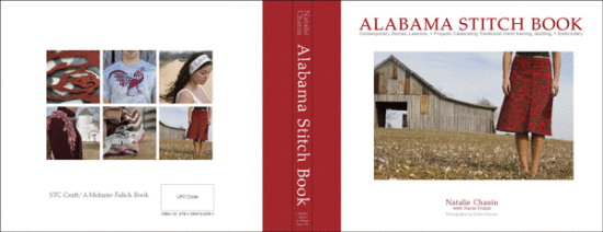
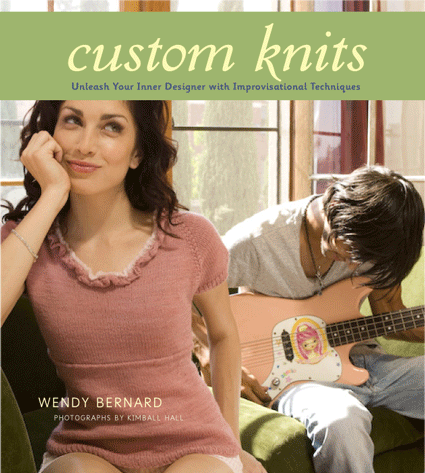
What you see when you look at a knitting book is the finished product: patterns that have been exhaustively reviewed; graphic design that has been overhauled nine times until every detail—from fonts and palettes to captions and dingbats—is exactly right; and beautiful photography, which is one of the most challenging (and important) aspects of the book-making process. Photography makes the first impression and sets the tone for the whole presentation. And that, of course, is why photo shoots can be so stressful—for the author, for the photographer and stylist, for the editor, for everyone. Everything you’ve been working on has built up to this moment, when every participant must tap into his or her most creative and fashionable resources, work together as a team, and record the garments in a matter of just a few days. And if you don’t get it right? Well, you either decide you can live with it or you find the time and resources to shoot it again. But the underlying tone of every photo shoot is this: Get it right.    

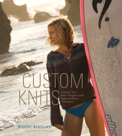
So when it came time to photograph the garments for the third book in the Custom Knits series—a book that will be entirely devoted to accessories—I decided to fly out to Los Angeles and station myself on set. The role of the editor on a photo shoot is fairly straightforward: Make sure that the knits are being photographed from every important angle, make sure that the right side of the garment is facing front (really!), and regulate anything that may look silly in the end. Like shiny pants on men. Or a model wearing yoga pants and a luxurious bouffant up-do. But most importantly, an editor must do all of this while giving the creative people space to do their thing.

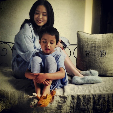
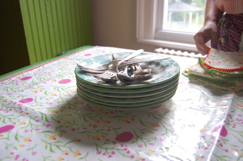
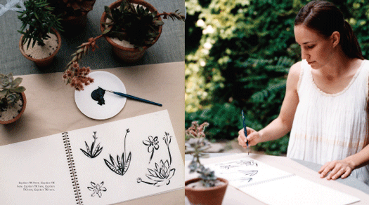
On the first day of our shoot, our lovely, talented, and hilarious author Wendy Bernard (see above) pulled out her needles and started working on a fingerless mitt. We had forgotten that we needed one more basic example of a glove type in the book, and so there she was, knitting a mitt that would be photographed the very next day. Red Dodge, our fabulous makeup and hair stylist, looked on with a sort of disbelieving amusement.

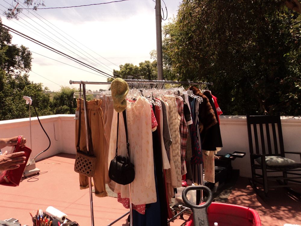
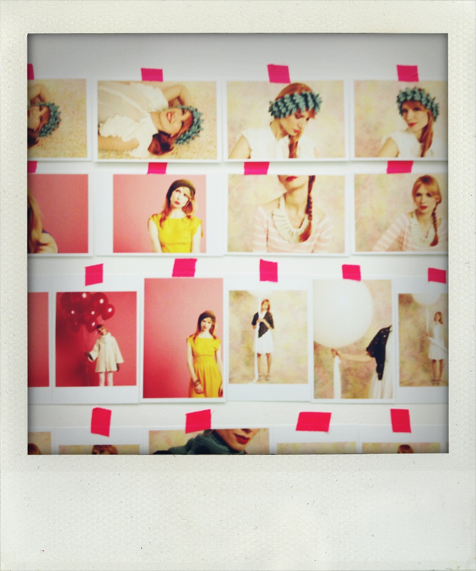
Our amazing stylist, Mark Auria, pulled out all the stops when it came to wardrobe. Mark stationed his racks of clothing—a mix of vintage dresses and lovely new items—on the porch at the house where we shot the first day, and between shots we would run to the garment racks and play with ideas, oohing, aahing, and vetoing until we found the perfect outfits for our darling models.

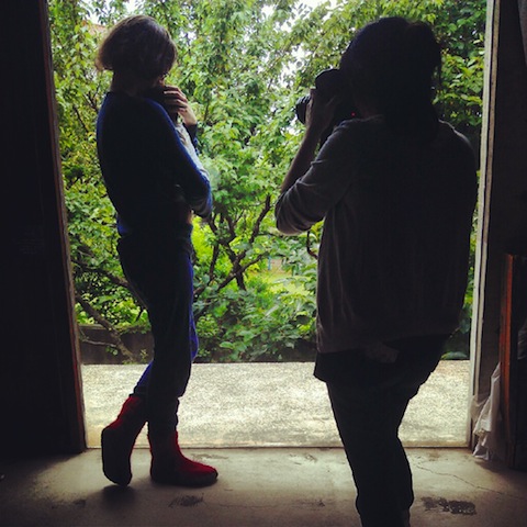
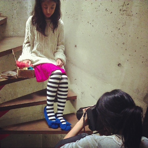
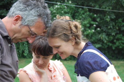
When you look at the final photos in a book, you’d never guess that there was a whole crew of people surrounding the model. Below are some of my behind-the-scenes shots: photo assistants holding reflectors, the stylist on hand to adjust the garment if it starts to go wonky, Wendy or I nearby to make sure the stitch pattern is showing, the makeup-and-hair whiz on hand to fix errant locks, and always someone in the background munching on a cookie, slurping a Coke, or fussing with a cell phone.

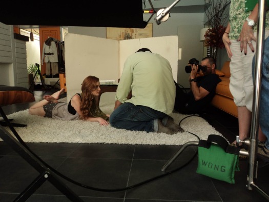
In the photo above, Mark, the stylist, adjusts the model’s scarf, as Joe Budd, our photographer, checks out light levels.

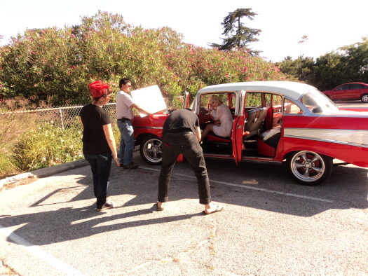
A group assembles around a 1950s Chevy (above) as the model drapes herself over the  steering wheel for a coy beret shot.

After taking the photo of these legwarmers (above), we decided that the white wall behind her was too cold and bare. So we moved the whole set-up across the patio so that we could use a wall with a little brickwork.

One of the most memorable days of the shoot was in Marina del Rey, out on a sailboat. It wouldn’t be a Custom Knits book without models in bikinis wearing knits, right?

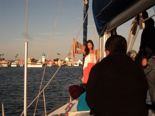
It was a chilly day by California standards, with lots of wind creating some mighty big waves. Our model was an absolute pro, so when you look at the photos, all you can see are her beautiful smile and Wendy's shawl in the golden glow of sunset—thankfully, you don't see her goose bumps or her trepidation about the boat tilting wildly from side to side.

Between shots, she wrapped herself up in a big, comfy sweatshirt and Joe, the photographer, showed her the photos so that they could talk about facial expressions and best angles before shooting the piece again.

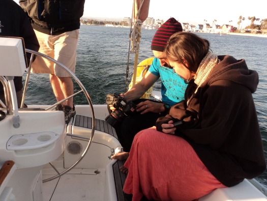
For the shot below, inspired by the cover of the May 2011 Anthropologie catalog, we went below deck. I love the dramatic way light is filtering through the shawl.

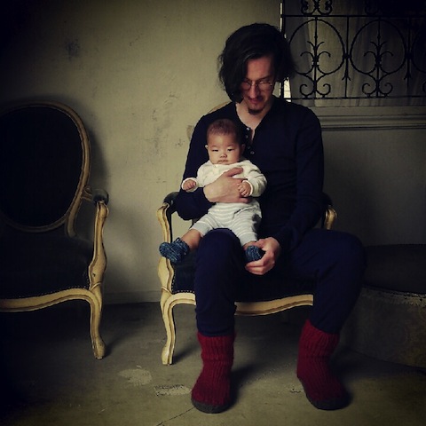
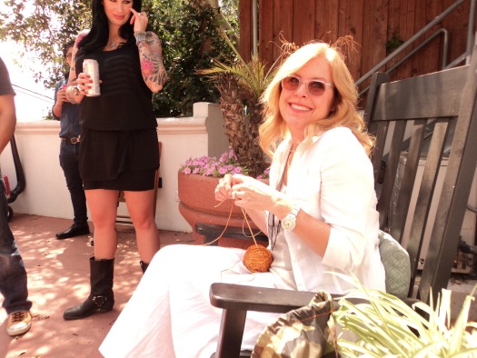
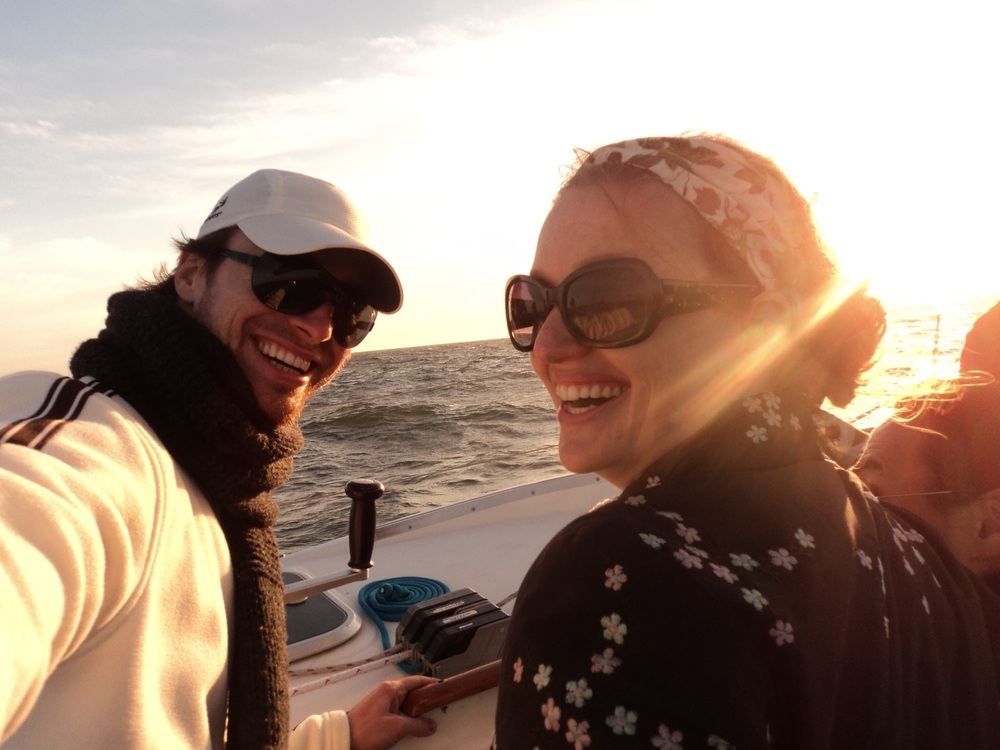
Once we set out to sea, we had quite the rollicking time. Amidst the huge waves, a bikini-clad model wearing a poncho hung onto the boat for dear life, and out of ten people on the boat, only three of them turned green during the ride. Oh, what we won’t do for a really great photo! And while I won’t share with you that particularly epic poncho shot just yet, I will share this photo of me and one of our male models (or M.P., a name we made up for the Custom Knits books which stands for “male prop”), laughing and laughing because we can’t believe how big the waves are and how much the boat is rocking.

When it was all said and done, we couldn’t have been happier with our gorgeous shots. And we can’t wait to share them with you in a couple of seasons! In the meantime, keep your eye out for the next beautiful book in the series—Custom Knits 2!—which is due to hit bookstores this October.

The Wee Wonderfuls Cover -- Behind the Scenes

For the cover of Wee Wonderfuls by Hillary Lang, we faced an overabundance of sweetness.

 We had Patchwork Penny at her sewing machine.


Our lovely model with (left to right) Little Miss Storybook, Wes, the Baby Giraffe, Ellie Bag, Katie Kitty, and I Heart You.


And the irrsistible Evelyn Inchworm.


Ultimately, our cover committee chose this group shot of Eddie, Margot, Pixie, Mermaiden, and Little Miss Storybook. What do you think? Which cover do you like best?

To see a gallery of images that made it into the inside of Wee Wonderfuls, click here.

Quilting for Peace--About the Cover and Getting Involved

We looked at a lot of cover variations before we chose a design for Quilting for Peace by Katherine Bell. We knew we wanted the cover of this book to be related to the cover to the first book in the series Knitting for Peace, but didn't feel like it needed to be identical. More than anything else, we wanted the cover to catch people's attention so that they would pick it up, and then feel inspired to quilt for good causes.

The cover above (a runner-up) features the Sawtooth Star Quilt, designed according to the guidelines of Quilts of Valor, an organization devoted to making quilts for veterans.

This multi-image cover (another runner-up) features (from left to right) a detail of an Easy, Striped Baby Quilt adapted from a pattern by Binky Patrol Founder Susan Hinch; the Sawtooth Star Quilt (see above); Mirabel the Owl, a softie made following a design by Softies for Mirabel founder Pip Lincolne; and a Recycled Sleeping Bag adapted from the Sleeping Bag Project pattern.

This is the cover we chose. It features the Preemie Pinwheel Quilt, adapted from a Quilts for Kids pattern.

 To see a few interior pages of this book, click on the book cover in the right margin. To learn about STC Craft's Quilting for Peace campaign, click here.

Reversible Knitting by Lynne Barr--How We Chose the Cover

All of us at STC Craft were excited and intrigued by the response to our Reversible Knitting cover post. Over 550 of you shared your opinions about the cover we chose and the three runner-ups. So, for today's post, as part of the Reversible Knitting blog tour,  I'm going to explain to you how we made our decision.

All of the covers and the interior of the book were designed by Sarah Von Dreele, with photographs by Thayer Allyson Gowdy. For several weeks Sarah and I collaborated on the cover design in preparation for the meeting at which I would present the choices to the cover committee (a group composed of our CEO as well as individuals who hold key positions in sales, marketing, publicity, and editorial). The cover committee makes the final cover choice.

Top left: Everyone loved this cover because of the great texture of Wenlan Chia's Winding Path sweater and because of the way it shows the two sides of the knitted fabric, plus the swatches of course. The cover committee was concerned that we might not be showing enough sweater and didn't like the model looking down (away from the customer). The Traveling Path sweater can be worn as shown on this cover as well as inside out and upside down (see bottom left cover and the gallery).

Top right: Graphically, this cover (like the others in this format) works beautifully, however no one felt that Lynne Barr's Two-Tone Vest was as eye-catching on the cover as the other options. One of the cool aspects of this vest is that it can be worn with either side of the fabric right side out and with either side in front or back (check out the gallery to see what I mean).

Bottom left: This cover, showing Wenlan Chia's sweater worn with the reverse side of the fabric outward (compared to the way it is being worn in the top left cover), was never a serious contender because it didn't show the swatches (such an integral part of the book) and because the color and graphic design seemed dull compared to the other options. That is why when I read everyone's responses, I was so surprised to find out how many people thought this was the best cover of all. I'll definitely keep this reaction in mind as we work on covers for future books.

Bottom right: This was the cover committee's top choice because it is colorful, shows a beautiful garment with a reversible cable (Reverse Me designed by Norah Gaughan), plus the swatches, and because the model looks friendly and approachable. Overall, this is the cover that everyone believed said "Pick up this book and take a look inside" most boldly and that, of course, is a cover's main purpose.


Thanks to everyone who commented . The winner of a copy of Reversible Knitting will be notified after the contest ends at 11:59pm on December 21, 2010. Meanwhile, if you have a few minutes, check out this fascinating Q&A with Lynne Barr here.

Reversible Knitting Blog Tour, Contest, and Alternate Covers!

Lynne Barr's blog tour has begun! Follow her via the schedule below, and discover compelling reviews, gorgeous pictures from the book, new insights about Lynne and her work, and more! And, if you leave a comment about which of the scrapped cover choices below is your favorite (or how you think the chosen cover above stands up to these), you may just win a copy of Reversible Knitting to cozy up to during long, cold January!

Limit one (1) entry per person; be sure to enter your email address on the comment form. NO PURCHASE NECESSARY TO ENTER OR WIN. Open only to legal residents of the 50 United States and Washington, DC, who are 18 or older as of date of entry. Contest ends at 11:59pm on Dec. 21st. Note that if you leave a comment we will add you to our e-mailing list (unless you tell us within your comment, that you do not want to be added.)

Dec. 08  http://goknitinyourhat.blogspot.com - Review

Dec. 09  http://www.grumperina.com - Q&A

Dec. 09  http://www.purlbee.com – Interview/book feature

Dec. 10  http://www.knitandtonic.net - Review

Dec. 11  http://chronicknittingsyndrome.blogspot.com Q&A

Dec. 11  http://www.sheepinthecity.prettyposies.com - Review

Dec. 14  http://aliciakachmar.com - Review

Dec. 15  http://boogaj.typepad.com - Project discussion

Dec. 16  http://knittingtoday.com/knews - Q&A

Dec. 17  http://www.ilgaleja.com/blog - "One designer to another" 

Dec. 17  http://retroknit.net/blog - Review / Q&A

Dec. 18  http://hookandi.blogspot.com - Review

Dec. 21  / - Special post

Dec. 22  http://needled.wordpress.com - "Stitch and size"

Jan.  tbd   http://houseonhillroad.typepad.com - Review

Jan.  tbd   http://the-panopticon.blogspot.com - Review


Weekend Sewing Cover Choices and Heather on TV

The process of creating the Weekend Sewing cover took awhile, but once we had worked through a few challenges, we ended up with a group of very strong choices. When you look at the runner-ups below and the cover we settled on, it's hard to imagine the anxiety that Heather Ross (the author), Brooke Reynolds (the graphic designer), and I (the editor) each experienced along the way.

To see the actual cover and some interior spreads from the book, click on the cover in the margin at right. (Fun fact: That's Brooke, our mulitalented graphic designer, in the tree.) To see a gallery of images from the book, click here. And to see Heather sewing with Martha Stewart, watch her on the Martha Stewart Show next Tuesday, May 19. UPDATE: If you missed the show, watch Haather's segment here.

Sewing Green Cover Choices--The Runner-Ups

When we were working on the cover for Sewing Green by Betz White, we seriously considered two covers: the one we chose and the one of the sewer at the table below. Although I feel sure that we made a good choice, I do miss seeing this pretty image since it didn't make it onto the cover or into the book.

 This one wasn't a serious contender but it is also nice to revsit.

To see the final cover and some pages from the interior, click on the book cover at right (under "Look Inside Our Books"). Or, to see the cover and a sampling of images from the book, click here.

Knitalong Cover - Runner-Ups

Larissa Brown, coauthor with Martin John Brown, of Knitalong, mentioned on her blog the other day that she had been looking at the runner-up covers I have been posting and wondered if there had been any other Knitalong covers considered that she hadn't seen. For that book, we didn't seriously consider a lot of different options. We had two single-image covers that we liked but we didn't think either of them  communicated enough about the book's content to work. Here they are (the second one was cut so early in the process that we didn't even begin to think about a back cover):


To see a gallery of images from Knitalong and the final grid cover, click here.

Alabama Stitch Book / More Covers (and Back Covers)

I go into most of our cover meetings with a strong opinion about which of the covers I'm presenting for a particular title I like best. For Alabama Stitch Book by Natalie Chanin, I actually had several favorites. Here are two of the covers we considered (with their corresponding back covers). All graphic design and photography by Robert Rausch.

 To see a gallery of images from Alabama Stitch Book and the final cover, click here.

The Gentle Art of Domesticity - Grapefruit Cover

This is one of the my favorite covers that wasn't chosen for the American edition of The Gentle Art of Domesticity by Jane Brocket; it was created by graphic designer Alissa Faden  Click here to see a gallery of images from Gentle Art's interior as well as the cover that Alissa designed that was chosen. And visit Jane's blog to see the British cover (and the cover to Jane's other new book Cherry Cake and Ginger Beer).


Printing by Hand - Deleted "Scenes"

We work with wonderful graphic designers on STC Craft books. After we send them photographs and sample copy (often a year or more before a book actually goes on sale), they design sample spreads. And once we've approved those, they generally work through 4 passes--over the course of many months--during which time the design and text are refined. Inevitably, there are times when we are unable to use a few of the most beautiful spreads.  When I suggested to Brooke Reynolds, the graphic designer of Printing by Hand by Lena Corwin (photographs by Thayer Gowdy), that we share some of those deleted "scenes," she jumped at the opportunity and sent me these spreads.

This is the original table of contents. Each circle shows a snippet of the artwork Lena designed for a project in the book.


This is the original introduction to chapter one. We ended up cutting it to 1 page because we were short on space.


We didn't have room for the photo of Lena working on the artwork for the Cafe Apron, but we did use the photo of her drawing pad in the section of Chapter 1 about transforming a design idea into artwork for printing.


To see more of what Brooke is up to, check out her new blog. And, while you're at it, check out Thayer's new blog too.