Behind the Scenes: The Knitted Slipper Book

We recently had an STC Craft first: a photoshoot in Asia! We feel so global chic. Mika Nakanishi photographed The Knitted Slipper Book by Katie Startzman, coming out in fall 2013,  in Tokyo. Our fabulous graphic desiger, Miao Wang, sent us some Instagram updates directly from the studio.

Even though we’re having a heat wave here, don’t these cozy slippers still look tempting? (And what about that baby?!)

I love how the weathered interiors of the photo studio create a contrast to the colorful footwear.

These bright blue ballet slippers are adorable. (And how about those striped tights?)

And what a gorgeous group of models.

A brilliant splash of color brightens up concrete walls.

Mika checks some settings while a little model patiently waits.

I can already hear the requests for these animal slippers in adult sizes.

How do we say "We love it!" in Japanese?

Pottery Class - Part 2

About two months ago, I left the safety of my orderly desk and ventured into a cermics studio for the first time, determined to learn the craft of turning clay into tableware. It's an art form that I have long admired, but the opportunity to learn how to do it never presented itself...that is, until I started working on Simon Leach's Pottery Handbook (a comprehensive guide for making wheel-thrown pottery, which we're editing now and planning to publish in Spring 2013). Now that I've completed my beginner's course, I can attest to the fact that a lot happens to clay on its way to becoming a pot: After its first spin around the wheel, the pot is deemed a "keeper" or a "do-over." If it's a keeper, then you set the pot under plastic for a few days or a week until it has firmed up and dried out a bit, at which point you put it back on the wheel and trim away excess clay, carving the bottom into a delightful shape. The pot is then bisque-fired in a kiln (which is sort of like prebaking a dough), and then it gets dipped in glaze and fired at super-high heat in a kiln, and this is where the glaze turns to glass, coating your creations in the most fascinating ways.

See how much I've learned?

I must be honest--I didn't know how much I would love seeing the finished product. As you may recall from my first post, as a beginner I was happy just to see the wet clay become a somewhat symmetrical shape. But the first time I saw my clunky little freshly glazed pots, I breathed out a sigh of wonder. Oh, would you look at that glossy finish!, I thought, when I first saw the little blue bowl above. Or, when looking at the bowl below: How fascinating that the turquoise came out so matte, with so much gray and deep navy blue...

My proudest achievement (so far, anyway) has been the little creamer below. When I first threw this pot, I had in mind that it would be a little bud vase, but then I looked at its rim and thought, if I squeezed the clay just so, I could create a spout. (For the record, the act of creating that spout required a fair bit of courage since it was a nice bud vase as it was, and some things really are better left alone.) But now that it's glazed, I can't imagine it any other way.

Admittedly, I seem to have a fetish for finger bowls, and my favored palette appears to be distinctly Mediterranean. I supposed it's a good thing I love olives and roasted almonds, since it looks like I'll be serving a lot of these at my house! And yes, it's true that almost every one of my pots is wonky, but that doesn't bother me too much. In fact, I now look at the ceramics sections in stores and cannot believe that there are potters out there who can throw tableware so consistently. Someday, I think, if I keep practicing, I might be able to do the same. But for now, I'm thrilled that I have challenged myself to learn something new, and I have the good fortune of being taught by and working with some of the best potters in the world as we develop what will truly be an amazing pottery book. And finally, I hope that this post inspires you to try your hand at something new--until you try, you'll never know what exciting, wonderful, and wonky creations will spring forth from your own two hands. What is it that you have always wanted to learn? Please share in the comments section below!

Behind the Scenes: Choosing a Cover for Modern Quilts, Traditional Inspiration

The title of Denyse Schmidt’s Modern Quilts, Traditional Inspiration perfectly expresses the book’s aim: to explore the traditional roots of a gorgeous collection of modern quilts. When we were deciding on a cover for the book, we knew we wanted this melding of modern and traditional to come across loud and clear.

Throughout the book, John Gruen’s beautiful photographs show Denyse’s quilts in contemporary interior settings, disputing the notion that quilts make an old-fashioned statement. So our graphic designer, Brooke Hellewell Reynolds, started our cover experiments with a simple and lovely photo of the Shoeman’s Puzzle quilt in a clean setting.

It’s a bit quiet, which is part of its appeal, but it doesn’t have the star power necessary for a cover. Luckily, it’s pretty and soothing vibe worked perfectly for the back cover of the book!

Denyse herself steered us in the right direction. She sketched up a vision she had: a super close-up photo of a quilt, stripped bare of the interior settings. 

Here are Sawtooth Stripe and Irish Chain. We were getting warmer!


Ocean Waves is a quilt that many pick as their favorite from the book. Unfortunately, there's no room for type!

The winner: Courthouse Steps. The diagonal design gave us both intense color and clean white space. Paired with the modern type, it looks graphic and fresh. But the blown-up stitches remind us of quilting’s traditional roots.

What do you think? Is the final cover your favorite?

Behind the Scenes on The Shape of Knitting Photo Shoot (plus Interview with photographer Thayer Gowdy)

Thayer (right) and stylist Karen Schaupeter on the photo set for The Shape of Knitting

Thayer Gowdy is a superstar at STC Craft. She’s an incredibly talented photographer who has shot a whopping 11 of our books, including Knitting Nature, The Repurposed Library, Printing By Hand, Reversible Knitting, and many more. I recently got to interview Thayer after she sent us some fabulous behind-the-scenes shots from Lynne Barr’s upcoming book, The Shape of Knitting (to be published on our Spring 2013 list). Read on for Thayer’s take on working on craft books, spontaneity on set, and incorporating confetti (lots of it!) into your life.

What was the theme of The Shape of Knitting shoot and how did you decide on it? Did the fact that you shot Lynne Barr's previous book--Reversible Knitting--affect any of your choices?

The theme was fun and chic and colorful, but also very clean. I’ve also been addicted to confetti lately, so that was a huge part of it! We had so much confetti; it was crazy. Reversible Knitting was a bit quiet and we shot it in a studio so it was very clean. I wanted to keep that thread for The Shape of Knitting, so we shot it in a studio again for a sophisticated look, but I also wanted to make it more colorful and playful.


You've shot quite a number of craft books for STC Craft/Abrams. What do you like best about these projects? What are some of your favorite memories from these shoots?

I love the creativity involved. Melanie gives us a lot of freedom and says “go for it.” I also love working as a team with stylist Karen Schaupeter. We come up with a vision, do research, and work together on the imagery. It’s all about creativity.


One of my favorite memories is when we shot the book The Repurposed Library. We shot the book in real homes that belonged to people I found online. One snowy day we ended up in the home of a retired writer and his wife, a children’s book illustrator. They made us a huge feast for lunch, including homemade soup. It was so welcoming. Most of my favorite memories come from people we meet along the way like that.


You seem to capture so many spontaneous moments. How do you encourage that spontaneity on set?

You have to leave room for things to happen. I like to keep the energy fun and playful, so people feel they can be spontaneous. It’s important to leave room for curiosity rather than trying to control things too much.


You shoot all over the world. What are some of your favorite places? 

Bali is my favorite place to shoot. It’s a melding of cultures, and it’s so visual. But it’s all the smells, the scents, the sights. Everything combines to create a beautiful sensory experience.


What do you like to do when you're not shooting?

I love to surf, and I’m about to plant a vegetable garden, which is really exciting. I love to travel; I can’t get enough of seeing new places. My boyfriend and I just got back from Mexico, and we’re excited to try making piñatas.

Which means you can use more confetti!

Exactly! I won’t be done with confetti any time soon.


Pottery for Beginners: Liana is at the Wheel!

A few years ago, one of our freelance graphic designers asked me if I had ever heard of the potter Simon Leach. Being a devoted fiber arts nerd, I had never wetted my hands with clay—not even in high school or college art classes—and so naturally I had never heard of Simon. But after she showed me a few of his YouTube videos, I quickly saw why thousands of potters were viewing his basic pottery lessons over and over: Simon Leach is a fantastic pottery teacher.

After roughly a year’s worth of conversations, Simon committed to making a pottery book with us, and we're thrilled that his book is on our Spring 2013 list. Pottery is a brand new category for STC Craft. As many of you know, we started out in 2003 primarily publishing knitting books, and then moved into sewing and quilting. Since then, we’ve branched out into printing, paper crafts, and even terrariums, but a large, comprehensive pottery book is new and exciting territory for us. And because it’s nearly impossible to edit a craft book without first understanding the craft, we decided that I really ought to get my hands dirty and take some pottery lessons

 In most pottery books instructions for throwing pots are broken down into a series of subtle hand movements—the left hand centers the clay on the wheel, the right hand lifts the clay into a cone, the middle and ring finger drill a hole into the center of the cone, and then the fingers pull outward to create walls and open the vessel. For each of these steps, there are accompanying how-to photos, and so—as an editor who had never touched clay before—I felt oddly smug reading through the instructions, thinking well this all makes perfect sense, or well that doesn’t seem so hard. But it wasn’t until I sat down at the wheel that I really understood what it takes to put the practice into action.

My first class was three weeks ago, and I must confess, I am not yet an expert potter. Shocking, I know! Oh, it’s true, I walked into that first class harboring some elaborate dreams that I would be a natural, cranking out perfect, delicate teacups every 15 minutes. But those subtle hand movements were a little trickier to put into practice than they seemed. Despite the initial challenges of my first class, I think you can tell from the photo above that I was having an awfully good time.

Truth be told, as a crafty girl through and through, I love the moment when you really gain respect for a craft. Not to say I didn’t respect pottery before I sat down at the wheel, but I do not think that I appreciated the subtle skill involved, nor did I understand how crucial the role of teacher is in this craft. Without the teacher—whether it’s an in-person instructor, a YouTube video, or a how-to book—we would all be lost!

Each of our classes begins with a demonstration from our instructor, Aimee. Watching an experienced ceramicist throw a pot on the wheel is an absolutely mesmerizing sight. (For that reason alone, you should really go check out Simon Leach’s YouTube videos.) When Aimee does her demo, as shown above, all of the students huddle around her as she expertly guides the clay into the most pleasing shapes, and then uses her throwing stick to trim away the excess clay at the bottom, making a perfectly curved shape. While Aimee's pleasing vessels are the ultimate goal for us aspiring potters, my funky little cylinders and bowls are getting better and better each week. But best of all, my understanding of how to edit the forthcoming Simon Leach’s Pottery Handbook are infinitely improved. As I work my way through this 8-week course, I'll be sure to keep you all up-to-date on my latest creations--be they wonky, cute, or laughable! Ta-Da--one of my first creations!

The Alabama Studio Sewing + Design Cover: Behind the Scenes

We’re thrilled to be publishing Natalie Chanin’s third book, Alabama Studio Sewing + Design. One of the hardest parts of the process was choosing a cover from all the gorgeous images we had! We knew we wanted the cover to look “of a piece” with Natalie’s previous books—Alabama Stitch Book and Alabama Studio Style--but not too similar. And we wanted to convey what the book is: a collection of basic clothing patterns that have endless variety when paired with hand-embellishment techniques.

We’ve used a photo grid design for Natalie’s other books, so we started there. This design made it far into the selection process, with its gorgeous fashion photo of a peachy dress and several close-ups of bead and applique embellishments.


The designer tried a couple more gridded designs that mixed model shots with embellishment details.


But in the end, it was something completely different that won out: a single image of two models in an embellished bucket hat design. It felt both striking and fresh, and it set this new book apart from the others in an elegant way.


What do you think? Which would you have chosen?


Knitting Nature Paperback Cover: Behind the Scenes

Norah Gaughan’s Knitting Nature is a beloved classic here at STC Craft. With 39 patterns inspired by nature, it has continued to inspire knitters since it was published in 2006. And now we’re releasing it in paperback! But we faced a tough question: Stick with the original cover (which we all loved) or spice it up with something new?

We started by trying the hardcover image with a new “STC Craft Classic” graphic to set it apart.


But the novelty of a new image won out, and our talented designer, Anna Christian, started experimenting. A favorite was this sweet image of our littlest model wearing mittens, but we decided against it in the end because of a couple of concerns: Would it look like a kid’s book? Was the spirit of the book really apparent in this image?

Another popular option was this gorgeous image of a model posed at the base of a tree. This photograph says so much about the book, especially in the way the lines of the tree are echoed in the model’s sweater.  

But ultimately, we felt this image (while stunning) isn’t really cover material. It’s a tad too subtle, and the scale of the tree dwarfs the sweater design.

And so we came to the clear winner.


We all love the bold colors and interesting perspective of this choice. It really grabs one’s attention; don’t you think?

Do you agree with our choice, or do you have another favorite here? 

Q + A with Denyse Schmidt


Denyse at work in her studio in Bridgeport, CT

One of the best parts of my job is meeting fabolously creative people and then having the opportunity to work with them (pretty much a dream come true!). I was thrilled to meet quilter Denyse Schmidt a few years ago (introduced by our mutual friend and another STC Craft author Heather Ross). I am even more thrilled and proud today to announce that we have just published Denyse's new book, Denyse Schmidt Modern Quilts, Traditional Inspiration: 20 New Designs with Historic Roots. Denyse is one of the hardest-working and most passionate people I know. When I think back on the year and a half she spent working on this book, the phrase blood, sweat, and tears comes to mind, though I'm not sure she literally put blood into it (she never mentioned any slips with the scissors). However, I can say with full confidence that she put love (for the quilts of the past and the new ones she created), sweat (over the hard work), and tears (because she wanted it to be perfect) into it. And the result is, well, as perfect as a book can be. Recently, both of us feeling a little more relaxed than we were a few months ago, sat down for this Q&A:

 Describe your book in 3 or so adjectives.

Beautiful, inspiring, a tribute to the quilters whose creations sparked my career.

What do you want people to take from your book?

I want them to feel inspired and to learn something. I want them to feel confident that they can take on something a bit more challenging than they have taken on before.

What was your favorite part of the bookmaking process?

I loved doing the research, going back through my files and old books and revisiting the quilts that were made a century ago, the ones that made me want to start my business in the first place. I feel driven to help people think about quilting in different ways, to see how quilts can be really modern, and to wipe away any musty, dusty stereotypes.

What was your favorite part of designing the quilts for the book?

I loved the early part of design phase when I felt like I had time to think a lot about what each quilt could look like, when I considered different fabrics, weighed all of the possibilities, and then narrowed down the choices and started making decisions.

I've been to your studio and know that you don't usually display finished quilts; I've only seen works in progress on your design wall. Why is that?

We don’t have a lot of room in the studio and I like to keep the walls clean except for the task at hand so I can really see what I’m working on. I usually don’t have the luxury of time to celebrate each accomplishment, and this is compounded by my tendency to always be focused on what’s next. So, finished work doesn’t have much of a chance to linger!

Do you display or use any of your quilts at home?

Right now I have two special-edition quilts on my beds at home: Tangerine Poppy in my room and Bone Snow in the guest room. I’ve been pretty attached to these for a while, but I’d like to start rotating in some new quilts.

I remember you telling me that you hand-stitched the Postage Stamp quilt and really enjoyed the process. What did you enjoy about making it?

I’ve always envied knitters because they can sit anywhere and knit and talk to people. If you use a sewing machine, you’re sort of tied to it. My machine is in the studio, so any sewing I do on it feels like “work.” It’s also a bit loud. Hand-sewing feels more reflective and quiet. Most of the quilts I do are quite large, but the Postage Stamp quilt is small and I could easily hand-piece it at home while watching a favorite PBS series. The blocks that make up Postage Stamp are tiny–each one is comprised of nine 1-inch squares–so I felt a sense of accomplishment as I went along and it didn’t take long to finish. A “scrappy” quilt like this is so much fun because you get to include tons of fabrics from your stash. Like most quilters out there, I have an extensive collection of prints, and I really enjoyed getting to use so many of them in this little quilt! 

Denyse's beautiful book. To see images of some of the quilts in it, including Postage Stamp, click here.

Introducing...The BUST DIY Guide to Life

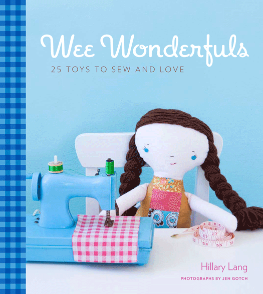
The idea for The BUST DIY Guide to Life came to us one day in fall 2009 as Melanie and I sat around the office, dreaming up future books. I said something like, wouldn’t it be amazing to do a book with BUST magazine, including hundreds of their craft and DIY projects from over the years? And Melanie said something like, let me give Debbie a call! And so we found ourselves just a couple weeks later having lunch with Debbie Stoller and Laurie Henzel, the editor in chief and creative director of Bust, talking about this exact book idea.

1,498 emails and 23 months later, we have a book! And so it is with great excitement that we want to tell you a bit about The BUST DIY Guide to Life and why we hope you will be excited about it, too.

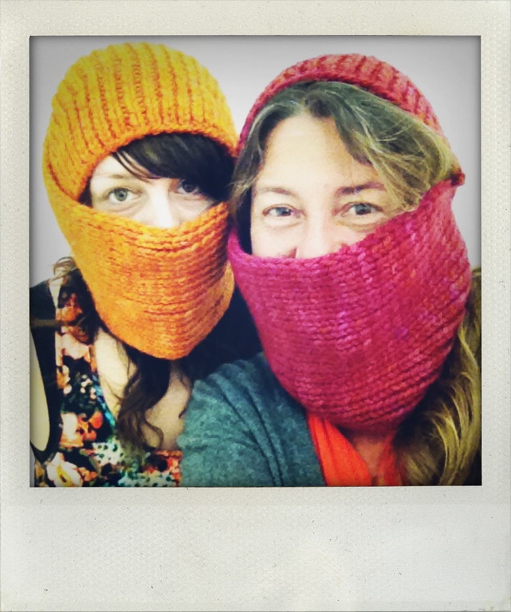
At our kick-off meeting with Debbie and Laurie, we had a really great conversation about the current craft community and what it means to be “DIY.” You see, ten years ago when so many of us were picking up our knitting needles for the first time or blowing dust off of our grandmother’s sewing machines, we were mostly single-subject kind of gals. We might knit, but that didn’t mean we were going to grow our own vegetables or make our own cheese. Slowly over the last decade, that mentality has changed, and a person who is willing (not to mention excited) to make her own sweater is fairly likely to also want to bake a pie, or cut her own bangs. And so, as we discussed articles from the magazine that could be repurposed in the book, we came to realize that so much of what Bust produces could be considered DIY: from removing stains to giving yourself a beehive hair-do to learning how to fix your bike to starting your own craft business. 

Brimming with excitement about this new kind of book, Melanie and I went back to the office and contemplated how many pages we would need to produce a book like this (the answer: 368), while Debbie and Laurie had their staff dive into the archives, flagging any articles that could be considered DIY, and developing categories, which roughly turned out to be these: home crafts, cleaning, gardening, sewing basics, repurposing clothing, jewelry making, hair-dos, make-up tricks, DIY soaps-n-scrubs, home remedies, cooking and entertaining, finance, travel, work-out tips, sex, marriage, birth, and death.

Phew! In a word, this project was feeling ambitious.

Once we picked our categories, we created an outline, and Debbie and Laurie dove back into the archives again, this time to extract all of the Word documents, photos, and illustrations. The writing styles from the articles were all over the map, so the first step was to retrofit the text so that it would have the same tone. After many months of wrangling this material, we handed all of the text and art files over to our graphic designer, Anna Christian, who flowed it into her design.

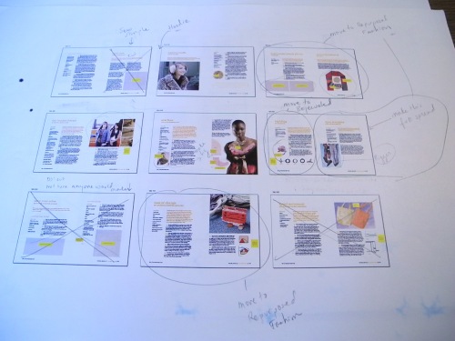
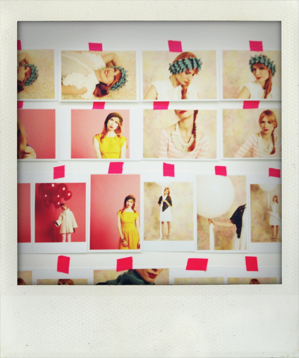
That’s when we discovered that the book was coming in at 520 pages (not the 368 pages that we needed it to be). I never in my life thought it would be possible to trim 152 pages from a book—after all, many of our books are  152 pages—but we rolled up our sleeves and hacked away at the book, moving things around, combining articles, cutting others. Above is just one “storyboarded” page from the book (each box represents two pages), which we used as a roadmap to tell the graphic designer what to cut and what to move.

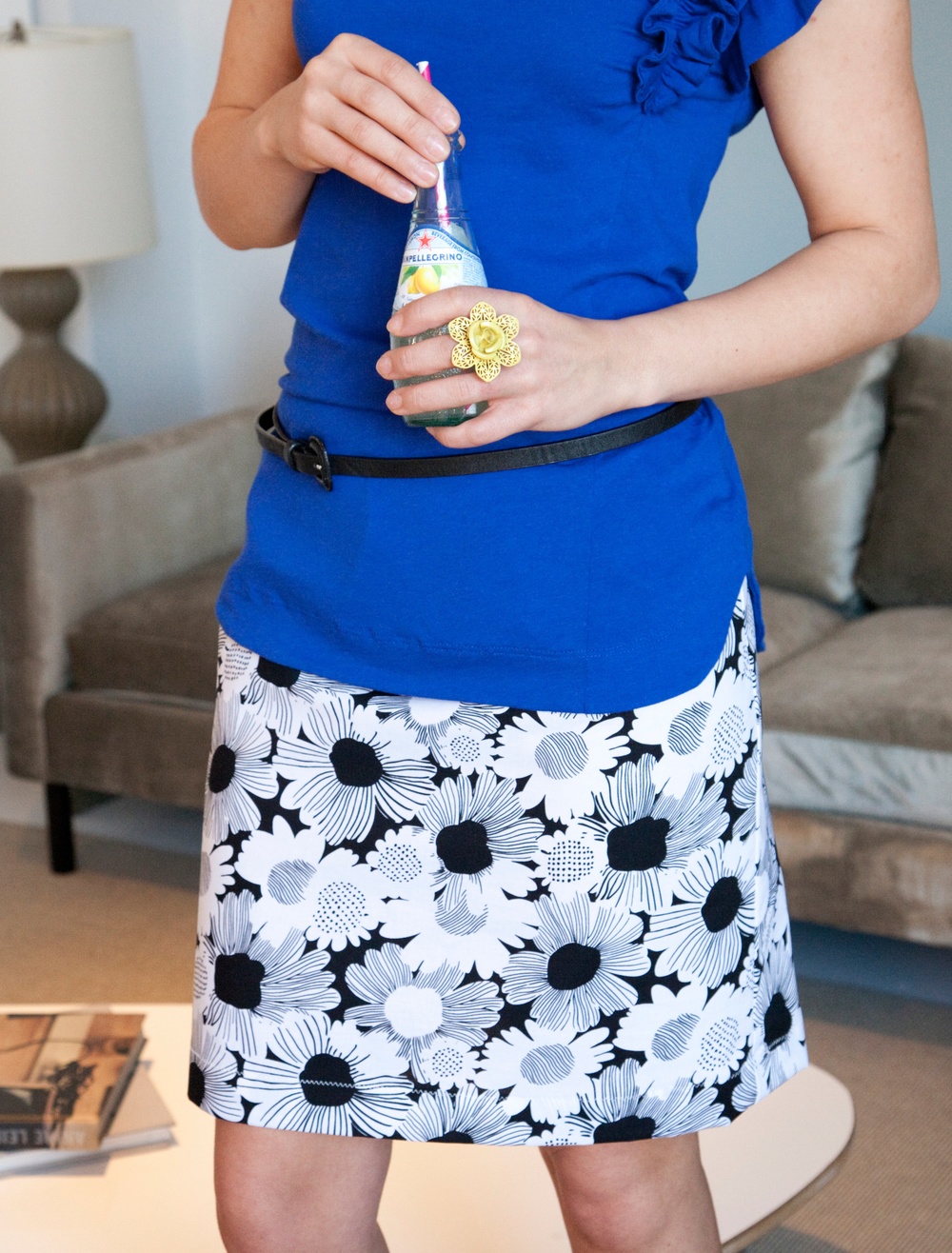
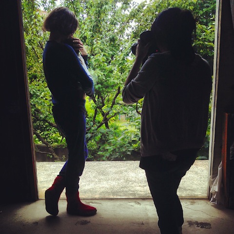
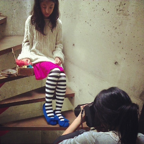
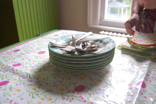
Some of the photos from the magazine were shot ten or more years ago, so we decided to give them a spruced up look. We picked about 25 projects to remake from scratch and had Marianne Rafter photograph them. Probably the most chaotic moment in the entire process of making this book was two days before the shoot when our sewist’s machine broke and she couldn’t finish the remainder of the projects. Debbie and I got on the phone and called every sewist we know in town (and many thanks to all of you who replied so quickly!). To make myself feel less stressed out, I went home that night and sewed three of the projects myself—a pillow sewn in the shape of a dachshund, a scarf made from sweaters, and this skirt shown above. Oh, the glamorous life of a craft book editor!


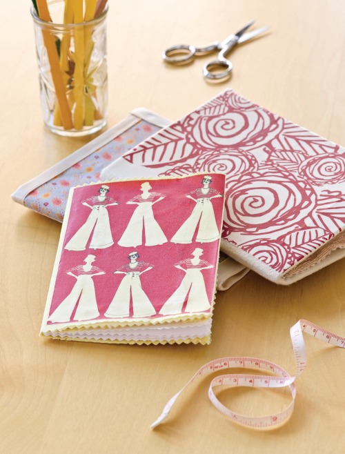
Despite all of the ups and downs creating this book, I must say, I was inspired every step of the way. I remember reading through the instructions for these cute fabric-covered sewn notebooks and thinking, hmmm…this looks so easy. That night I went home and whipped up a set of my own.

In the grips of winter, I made myself some sugar scrub using the recipe in the book, adding tangerine essential oils to add some cheerfulness.

For a friend’s party in March, I followed the instructions for giving myself a Frida Khalo hair-do, which garnered rave reviews from friends!

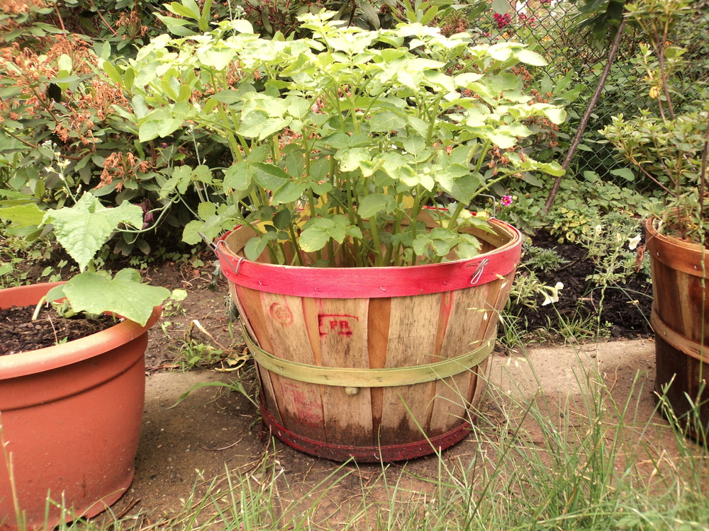
And that’s hardly scratching the surface…I’ve also made piñatas, flower hair-pins, and homemade butter. I've repaired my bra when the underwire poked through, and I've even grown potatoes in a bucket (yes, those are my potatoes shown above, and yes, potato plants look like this!) Not to mention, the Bust DIY Guide to Life even helped me plan my wedding. I was engaged while working on the book and was beginning to feel a bit stressed about the preparations. I remember reading this sentence in the “Planning a DIY Wedding” article and feeling greatly comforted: If you’re planning a DIY wedding, all you really need is an officiant, the papers, and the love of your partner. Everything else—and we mean everything—is totally optional.

So, if it isn’t totally obvious, I became pretty passionate about this book during the process. It was a primary focus for STC Craft between January of 2009 and May of 2011, and we couldn’t be prouder of how it turned out. To check out more of the images from the book, be sure to check out the gallery here. But really, nothing quite matches the experience of flipping through it yourself—there is sure to be something (or a dozen things) that you will want to make, learn, or grow for yourself—so be sure to preorder a copy or take a look when it hits bookstores this October!


Shooting Heather Ross's Book at Melanie's House

Over the years I have worked at STC Craft, many photos for many of our books have been photographed at Melanie’s house. (When I’ve seen these photos after the shoot is finished, I’ve actually found myself thinking “and now it’s really a Melanie Falick Book.”) From Sewing Green to Knitalong to Weekend Sewing, Melanie’s home makes numerous appearances. And if you look closely, in almost all of these books, you’ll even see the infamous grass-green cabinet. (It’s shown above on the lefthand side, though the cover of Sewing Green is where the cabinet makes its most prominent appearance.)

And so, as we set out last week to do a final day of shooting for Heather Ross’s upcoming book, Heather Ross Prints (due in stores in fall 2012), we decided to keep things easy and head up to Melanie’s house in Beacon.

One thing that is great about shooting at Melanie’s house is that she has loads of antiques and interesting home wares, many of which we integrated into the shots. For instance, the Anthropologie dishes in the photo above are shown along with her grandmother’s silver--together they make a fabulous not-too-matchy match with Heather’s tablecloth and napkin projects.

But of course, if you know Melanie at all, you know that she is a Tab soda fanatic. And so, along with the antiques, we had to give Tab a cameo in a detail shot of the sarong project (the sarong is on the chair, just out of frame). I snapped this low shot while the real shot that will be in the book was being set up.

While every person at a photo shoot plays a key role, from the photographer (of course) to the person who goes to pick up the food for lunch (a VERY important job), our stylist, Karen Schaupeter, was a huge player. From keeping us on schedule to beautifully matching Heather’s prints within a setting, Karen moved quickly and kept things fun. In the photo above, she’s actually texting while ironing—talk about a multi-tasker!

As the stylist, Karen is in charge of bringing every possible prop we might need that day and organizing it so it will be at the ready. Shown above is just a small portion of the props spread out amongst the projects.

And here are two adorable pincushions that Heather provided as possible props. They may not have made it into the book, but they did make it onto the blog.

Shooting in a house can give you a world of options, but it can also have its limitations. For this shower curtain shot, Karen, the stylist, and John Gruen, the photographer, had their work cut out for them. Not only is the bathroom so small that you can’t possibly shoot a shower curtain from inside of it, but there wasn’t even a shower rod (only a tub). With some lighting poles and studio magic, we were able to fabricate a curtain rod and get just the right angle out in the hallway, producing what turned out to be one of our favorite shots. In fact, we liked the light in the bathroom so much that we wound up moving a table in there and shooting some still lifes on it.

And of course, on a photo shoot there are three things that you’ll see people doing a lot: checking their phones, snacking, and huddling over the camera to see how the shots are turning out. In this photo, Karen, John, and I gather around the camera to flip through the apron shots. And that’s right, I’m the one wearing the apron. (Again, when you shoot at Melanie’s house, you use the props on hand—including people.)

But the best part of shooting at Melanie’s house, aside from the great hospitality and the unlimited Tab, has to be her loyal companion, Molly—one of the sweetest dogs I’ve ever met. I love how you can barely see her tail in this photo because it’s wagging so happily. Aside from a bit of dog hair that needed to be lint-rolled off of the projects now and then, there’s nothing like a sweet pup to make a day of shooting that much more fun.

Designing Fabric with Heather Ross--Lucky Me


Last week I hit the jackpot when it comes to being a craft book editor. I learned how to design my own fabric with none other than Heather Ross. We were working together on her next book, Heather Ross Prints, which we will publish in Fall 2012. While Weekend Sewing, Heather's first book, was a tour de force full of gorgeous, doable sewing projects, her next book will focus on all manner of crafts that can be made using fabulous repeating designs, hers (see sampling below) and your own (just keep reading). 

One of the first chapters in Heather Ross Prints is dedicated to teaching crafters how to make their own repeating designs using artwork of their making and/or choosing. Up until last week, this section of the book was making Heather and I feel both nervous (“How exactly will we do this?”) and excited (“It will be so cool if we can do this!”). So, once Heather had written her first draft, I printed it out, wrote out a million notes and questions, and headed downtown to Heather’s apartment. After being treated to an amazing homemade lunch—Heather is 8½ months pregnant, and so, according to her, lunch is a “big deal”—we sat down at the computer and started reviewing the manuscript.

About five minutes into the process, I turned to Heather and said, “I really think it would be most effective if I tried to create my own repeating design following your instructions…you know, to see if it works.” And so she handed over a sketchpad and said, “Sure, what would you like to draw?”

As she warned in her manuscript, this would be the scariest moment of the design process. What should I draw? Can I draw? These questions were running through my head. But before I committed to just drawing a simple circle or star, I thought, I’d like to try to draw my favorite animal: a bear. With some artistic tips from Heather regarding the shape of the nose and the hulk of the belly, I suddenly had a bear (shown below alongside Heather's bafflingly cute donkey.)

Once the sketch was done, we scanned it into the computer and Heather taught me how to turn it into an illustration. It was my first time drawing with a stylus, and true to another warning in her manuscript, it was pretty awkward. While coloring in my bear, I could not stop laughing every time I got near the “outline,” knowing that mine would be super wobbly. But after some practice, I got the hang of it and could make fairly controlled strokes.

After about an hour or so of coloring in the background, playing with different hues, and shading some areas of the bear, we saved the file and uploaded it to Spoonflower—a site where you can print your own designs onto fabric of your choosing and buy it by the yard.

Next we played with the repeating design.

Seeing my silly little bear design up on the screen felt so empowering. It was unbelievable that in just an afternoon, I was able to use my humble artistic skills to create a fabric design that I will proudly use to make pajama bottoms for the whole family next Christmas. How cool is that?

Having gone through the process myself now, I feel confident that this is something anyone can do, and I personally can't wait to sit down and do more. But for now, I should probably get back to the editing.

Thanks again, Heather!


Custom Knits Photo Shoot

What you see when you look at a knitting book is the finished product: patterns that have been exhaustively reviewed; graphic design that has been overhauled nine times until every detail—from fonts and palettes to captions and dingbats—is exactly right; and beautiful photography, which is one of the most challenging (and important) aspects of the book-making process. Photography makes the first impression and sets the tone for the whole presentation. And that, of course, is why photo shoots can be so stressful—for the author, for the photographer and stylist, for the editor, for everyone. Everything you’ve been working on has built up to this moment, when every participant must tap into his or her most creative and fashionable resources, work together as a team, and record the garments in a matter of just a few days. And if you don’t get it right? Well, you either decide you can live with it or you find the time and resources to shoot it again. But the underlying tone of every photo shoot is this: Get it right.    

So when it came time to photograph the garments for the third book in the Custom Knits series—a book that will be entirely devoted to accessories—I decided to fly out to Los Angeles and station myself on set. The role of the editor on a photo shoot is fairly straightforward: Make sure that the knits are being photographed from every important angle, make sure that the right side of the garment is facing front (really!), and regulate anything that may look silly in the end. Like shiny pants on men. Or a model wearing yoga pants and a luxurious bouffant up-do. But most importantly, an editor must do all of this while giving the creative people space to do their thing.

On the first day of our shoot, our lovely, talented, and hilarious author Wendy Bernard (see above) pulled out her needles and started working on a fingerless mitt. We had forgotten that we needed one more basic example of a glove type in the book, and so there she was, knitting a mitt that would be photographed the very next day. Red Dodge, our fabulous makeup and hair stylist, looked on with a sort of disbelieving amusement.

Our amazing stylist, Mark Auria, pulled out all the stops when it came to wardrobe. Mark stationed his racks of clothing—a mix of vintage dresses and lovely new items—on the porch at the house where we shot the first day, and between shots we would run to the garment racks and play with ideas, oohing, aahing, and vetoing until we found the perfect outfits for our darling models.

When you look at the final photos in a book, you’d never guess that there was a whole crew of people surrounding the model. Below are some of my behind-the-scenes shots: photo assistants holding reflectors, the stylist on hand to adjust the garment if it starts to go wonky, Wendy or I nearby to make sure the stitch pattern is showing, the makeup-and-hair whiz on hand to fix errant locks, and always someone in the background munching on a cookie, slurping a Coke, or fussing with a cell phone.

In the photo above, Mark, the stylist, adjusts the model’s scarf, as Joe Budd, our photographer, checks out light levels.

A group assembles around a 1950s Chevy (above) as the model drapes herself over the  steering wheel for a coy beret shot.

After taking the photo of these legwarmers (above), we decided that the white wall behind her was too cold and bare. So we moved the whole set-up across the patio so that we could use a wall with a little brickwork.

One of the most memorable days of the shoot was in Marina del Rey, out on a sailboat. It wouldn’t be a Custom Knits book without models in bikinis wearing knits, right?

It was a chilly day by California standards, with lots of wind creating some mighty big waves. Our model was an absolute pro, so when you look at the photos, all you can see are her beautiful smile and Wendy's shawl in the golden glow of sunset—thankfully, you don't see her goose bumps or her trepidation about the boat tilting wildly from side to side.

Between shots, she wrapped herself up in a big, comfy sweatshirt and Joe, the photographer, showed her the photos so that they could talk about facial expressions and best angles before shooting the piece again.

For the shot below, inspired by the cover of the May 2011 Anthropologie catalog, we went below deck. I love the dramatic way light is filtering through the shawl.

Once we set out to sea, we had quite the rollicking time. Amidst the huge waves, a bikini-clad model wearing a poncho hung onto the boat for dear life, and out of ten people on the boat, only three of them turned green during the ride. Oh, what we won’t do for a really great photo! And while I won’t share with you that particularly epic poncho shot just yet, I will share this photo of me and one of our male models (or M.P., a name we made up for the Custom Knits books which stands for “male prop”), laughing and laughing because we can’t believe how big the waves are and how much the boat is rocking.

When it was all said and done, we couldn’t have been happier with our gorgeous shots. And we can’t wait to share them with you in a couple of seasons! In the meantime, keep your eye out for the next beautiful book in the series—Custom Knits 2!—which is due to hit bookstores this October.

Oliver + S Paper Dolls: Another Day at the Office

Obviously, the main attraction of Oliver + S Little Things to Sew is Liesl Gibson's impeccably designed sewing patterns for children. But a major perk are the charming paper dolls that come with it--a boy and a girl, which you'll find on a piece of perforated cardstock at the back of the book. To dress the paper dolls, you (or your kids) can cut out the "clothing" from the book's jacket.

We spent a lot of time working with our printer to get the cardstock just right--it's never fun to play with a flimsy paper doll! Another consideration was the lamination on the jacket--too much lamination and the tabs on the clothing wouldn't bend properly; too little and they might tear. When we thought we had the balance just right, we felt it was only prudent to have someone take the dolls and clothing for a "test run." (Also, don't we all need an excuse to play with paper dolls at work?) We asked Wesley Royce, an assistant editor at STC, to take on this very important job, and we certainly didn't have to ask twice.

Wesley happily set about her task, cutting out clothing and dressing her dolls, and lthen we played with them at our desks, pleased to confirm that all of the tabs bent back just so and the dolls stood tall and proud. Another day at the office.

STC Craft Spring Books in Bloom


It's not quite spring outside--no daffodils poking through the soil yet--but there are signs of spring in our office and in bookstores and craft stores everywhere. STC Craft's spring 11 collection is making its way to retailers now. First up are Oliver + S: Little Things to Sew by Liesl Gibson and A Knitter's Home Companion by Michelle Edwards. Modern Paper Crafts by Margaret Van Sicklen is being released next week. You can see sample pages from these three books by clicking on the covers in the right-hand margin. Upcoming soon are The Repurposed Library by Lisa Occhipinti, Loop-d-Loop Lace by Teva Durham, and Stitch Magic by Alison Reid. You can see photo galleries for all of these books (except for Stitch Magic but stay tuned) by clicking on their respective titles under "Galleries" in the right-hand margin. The weather where I live is cold and wet today, but the views inside these books are bright and beautiful. Spring is on its way.


The Wee Wonderfuls Cover -- Behind the Scenes

For the cover of Wee Wonderfuls by Hillary Lang, we faced an overabundance of sweetness.

 We had Patchwork Penny at her sewing machine.


Our lovely model with (left to right) Little Miss Storybook, Wes, the Baby Giraffe, Ellie Bag, Katie Kitty, and I Heart You.


And the irrsistible Evelyn Inchworm.


Ultimately, our cover committee chose this group shot of Eddie, Margot, Pixie, Mermaiden, and Little Miss Storybook. What do you think? Which cover do you like best?

To see a gallery of images that made it into the inside of Wee Wonderfuls, click here.

Quilting for Peace--About the Cover and Getting Involved

We looked at a lot of cover variations before we chose a design for Quilting for Peace by Katherine Bell. We knew we wanted the cover of this book to be related to the cover to the first book in the series Knitting for Peace, but didn't feel like it needed to be identical. More than anything else, we wanted the cover to catch people's attention so that they would pick it up, and then feel inspired to quilt for good causes.

The cover above (a runner-up) features the Sawtooth Star Quilt, designed according to the guidelines of Quilts of Valor, an organization devoted to making quilts for veterans.

This multi-image cover (another runner-up) features (from left to right) a detail of an Easy, Striped Baby Quilt adapted from a pattern by Binky Patrol Founder Susan Hinch; the Sawtooth Star Quilt (see above); Mirabel the Owl, a softie made following a design by Softies for Mirabel founder Pip Lincolne; and a Recycled Sleeping Bag adapted from the Sleeping Bag Project pattern.

This is the cover we chose. It features the Preemie Pinwheel Quilt, adapted from a Quilts for Kids pattern.

 To see a few interior pages of this book, click on the book cover in the right margin. To learn about STC Craft's Quilting for Peace campaign, click here.

Meeting Kaffe Fassett--And a Sneak Peek at His Newest Book

Back in the early 1990s, I was working as a freelance writer and editor and got the idea that I wanted to focus on crafts. I started seeking out and pursuing opportunities and was lucky enough to be invited on a trip to the Shetland Islands in order to write articles for a few different magazines. One of the featured guests on the trip was Kaffe Fassett, so I made arrangements to interview him. A short version of the interview was published in Fiber Arts magazine and a longer version in the Rowan magazine. I remember being nervous about the interview but, when it was over, thinking it had gone pretty well. I found Kaffe to be warm and friendly and was impressed by the articulate, clever, and poetic way in which he described the beautiful landscape surrounding us. I must have made a decent impression on him because I am now proud to say that, all these years later, I am the editor of Kaffe's upcoming book Kaffe Fassett's Simple Shapes Spectacular Quilts. In SSSQ, Kaffe demonstrates how basic geometric forms--squares, rectangles, triangles, diamonds, circles, and quarter-circles--found in natural and manmade environments inspire his quilt designs. During our interview in Shetland, Kaffe said this to me: "I spend my life wanting to stand up and yell 'Hey! Look, we're passing through Paradise.' But everyone's too busy reading newspapers." Today he might say people are too busy texting or checking their email. SSSQ is definitely a wakup call. I guarantee that once you experience it you'll feel inspired to look up from your newspaper or whatever screen is absorbing you to see the beautiful shapes and colors around you. If you're a quilter, you'll likely want to incorporate that beauty into your quilts. But even if you're not a quilter, I think you'll still be inspired. SSSQ will be in stores in March. Today I'm happy to offer you this sneak peek.

Reversible Knitting by Lynne Barr--How We Chose the Cover

All of us at STC Craft were excited and intrigued by the response to our Reversible Knitting cover post. Over 550 of you shared your opinions about the cover we chose and the three runner-ups. So, for today's post, as part of the Reversible Knitting blog tour,  I'm going to explain to you how we made our decision.

All of the covers and the interior of the book were designed by Sarah Von Dreele, with photographs by Thayer Allyson Gowdy. For several weeks Sarah and I collaborated on the cover design in preparation for the meeting at which I would present the choices to the cover committee (a group composed of our CEO as well as individuals who hold key positions in sales, marketing, publicity, and editorial). The cover committee makes the final cover choice.

Top left: Everyone loved this cover because of the great texture of Wenlan Chia's Winding Path sweater and because of the way it shows the two sides of the knitted fabric, plus the swatches of course. The cover committee was concerned that we might not be showing enough sweater and didn't like the model looking down (away from the customer). The Traveling Path sweater can be worn as shown on this cover as well as inside out and upside down (see bottom left cover and the gallery).

Top right: Graphically, this cover (like the others in this format) works beautifully, however no one felt that Lynne Barr's Two-Tone Vest was as eye-catching on the cover as the other options. One of the cool aspects of this vest is that it can be worn with either side of the fabric right side out and with either side in front or back (check out the gallery to see what I mean).

Bottom left: This cover, showing Wenlan Chia's sweater worn with the reverse side of the fabric outward (compared to the way it is being worn in the top left cover), was never a serious contender because it didn't show the swatches (such an integral part of the book) and because the color and graphic design seemed dull compared to the other options. That is why when I read everyone's responses, I was so surprised to find out how many people thought this was the best cover of all. I'll definitely keep this reaction in mind as we work on covers for future books.

Bottom right: This was the cover committee's top choice because it is colorful, shows a beautiful garment with a reversible cable (Reverse Me designed by Norah Gaughan), plus the swatches, and because the model looks friendly and approachable. Overall, this is the cover that everyone believed said "Pick up this book and take a look inside" most boldly and that, of course, is a cover's main purpose.


Thanks to everyone who commented . The winner of a copy of Reversible Knitting will be notified after the contest ends at 11:59pm on December 21, 2010. Meanwhile, if you have a few minutes, check out this fascinating Q&A with Lynne Barr here.